Monday, 3 May 2010

By Midnight trailer


This is the completed version of my film trailer, originally the green screen was at the end of the trailer but after listening to the audience feedback I decided to put it at the beginning of the trailer to make it look more realistic.

By Midnight magazine cover

This is the magazine cover for my trailer 'By Midnight'. I also chose the colours red and white for my cover so it fitted in with my poster and trailer. I chose to name my magazine 'Action' because it is associated with film and the production side to it. I thought this would be a good title for a movie magazine and is short and snappy and easily recognisable by an audience.
I followed typical forms and conventions when making my magazine cover because I thought this would make it look more realistic and professional. I put a barcode and price on the bottom of the cover, this is the same as other magazine covers I have looked at. I included a banner on my magazine cover featuring other films, most magazines do this because it appeals to a wider demographic. I used buzz words such as 'Exclusive' and 'Plus' to entice the audience and make it look more realistic.

I turned the main image black and white so it would fit in with the rest of the magazine cover and work as a contrast to the coloured text.

By Midnight poster

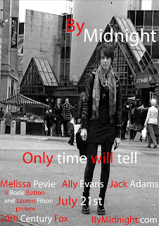
This is the poster for my film 'By Midnight'. I chose the colour scheme red and white for the text because these are the colours used in my trailer and I wanted it to be recognised with the trailer by using the same colours.

I used the caption 'Only time will tell' because the film is about a bomb on a train and whether it will be detonated, I thought this caption would add to the suspense and interest the audience in the film.

Whilst analysing previous film posters I noticed that the actors names were on them so I decided to follow these conventions and do the same. I also noticed the directors name is present on film posters, therefore I also included this onto the poster. The date of release was featured prominently on other posters so I put the release date in the middle of all the text in a bigger size font to grab the audience's attention. I also noticed that a website was found at the bottom of each poster that the audience could visit and get more information on the film.

I manipulated the image by turning it black and white, I did this because I thought it gave a more serious tone to the poster and made it look more professional, also I wanted the text to stand out and thought I would achieve this better if it contrasted with the background.

Evaluation

Please click on the following link to view my evaluation


http://prezi.com/arwahb5kcmhx/edit/

Friday, 23 April 2010

List of actors

When we came to the process of picking characters to be in our trailer, it proved to be more difficult task than we had first thought. We originally wanted a male to act as the terrorist, however when we thought about it in more depth we decided we wanted the terrorist to be a girl so we could challenge regular codes and conventions.

Ally Evans - terrorist

Melissa Pevie - news reporter

Wednesday, 24 March 2010

Storyboard new idea

This is the newer version of our storyboard, we made a few changes to this idea but overall we stuck to this idea well.


Thursday, 11 March 2010

The Dark Knight poster analysis

This is one of many posters for The Dark Knight however i thought this one best promoted the film - all the smoke and sparks gives the impression of disruption and sheer chaos.

The infamous batman logo is featured prominently twice on the poster, the most noticeable logo is one full of flames, this is against a dark background so grabs the audiences attention.

A low angle shot is used for this poster - this gives the impression of the main character being strong and in control. At the top of the poster the phrase 'Welcome to a world without rules' is used - this further supports the idea of absolute chaos and will make the demographic want to see just what will happen in the film.

The website at the bottom of the poster gives the audience the chance to find out more about the film. The date of release is in block capitals and is in a bolder font than the rest of the text - this is important information because it tells the audience when the film is available to watch.